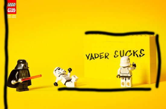
The original designers were Diego Mourao and Gustavo Dorietto from Escola Cuca in Sao Paulo, Brazil. Here is the link https://pialeichter.squarespace.com/blog/2011/02/http66.html. This ad was one among others done for a Lego Star Wars ad campaign. Contrast – The biggest contrast to me is the colors that were chosen. Darth Vader is obviously much darker than the background. The viewers eyes are instantly drawn to his dark figure making him the focal point of the ad. Also the words ‘Vader Sucks’ because of their dark color on top of the bright yellow. Repetition – The ad uses repetition with the storm troopers, the two white characters, to create a balance in the ad. There is also a use of red in the light saber help in Darth Vader’s hand and in the Lego logo in the upper left hand corner. Alignment – The only obvious alignment is the yellow wall. Your eye begins on the dark figure and then naturally goes to the right. The wall creates alignment which makes your eye automatically goes down and you look at the rest of the picture. There is also some on the far left side with the Logo and some text on top aligned with the black cape of Darth Vader below it. The storm troopers also are aligned at the feet. Proximity – Proximity is shown by the white character that is closest to the wall. If he were far from it we would not know he was spray painting it. However, because he is so close and facing it we know that it was him. Color – The yellow color is bright and warm. It also shows that the storm troopers are care free and irresponsible. On the other hand, Vader is a dark black showing his power and authority.
All of these things put together create harmony within the ad. It is obvious what the ad is suggesting to anyone with some knowledge of Star Wars and is funny and inviting. I think this ad did a great job in applying these principles.