I had heard of return on investment before but I never really understood it and how to calculate it. I had not, on the other hand, heard of conversions. A conversion can be anything that you see as valuable that a customer does after visiting your ad. I can see this as extremely valuable for all online businesses. Knowing what people do on your site after they click on your ad can help you to know exactly what it is that you need to change, make easier to access and many other things. Ad optimization is something I know that I need to continue to work on. My CTR this first few days of my campaign has been very low. I think I need to add a bit more of a description to my ads and also use the keywords used by those browsing the internet. My ‘college tech’ googlers have been clicking the most on my site. I see this as an opportunity to make my ads more directed towards them. That way I can get even more clicks and have those clicks coming from my target audience.
Author: mikekwom
Relevance & Quality Score
Learning about what Google Analytics can do has gotten me very excited to see the people who are visiting my site. I think one of the most helpful parts will be the ability to see where exactly on my website people go to the most and where they leave my site the most. I would assume that if they are leaving the site from a certain page then there is a problem with that page and I need to do some stuff to fix it. Being able to pinpoint flaws on my site will have a huge impact on how I can learn and also grow my business to be something successful and appealing to all those who view it. I think that quality score will help in knowing how effective my ads are and also what it is I need to do to improve them if needs be. I think these two tools together, when used correctly, will help me very much to make my advertising, site appeal and business as a whole much more effective.
Google Ads & Keywords
This week we learned about google ads and keywords and how to best put them to use. Something important that I learned was that it is best to use keywords that are specific to your target audience. Using keywords that are too vague will get you clicks from people who are not necessarily those who are interested in your product or service. If you use words that are specific you may get less clicks but the clicks you get will be from people who may actually purchase your product or service. It is always better to have quality over quantity. Not to mention that it is very likely that it will cost less because they typically get less clicks. I also learned that ads should also be specific and let those who are viewing it know exactly what it is you are offering. Also, if your ad is promoting something specific, when the viewer clicks on it they should be taken directly to the page that is offering that service.
Legal Structure
This week we learned about legal structure in business. I was very interested to learn about the different types of legal structures in business. I think for me and my situation right now, sole proprietorship is the best option. This is for a few reasons. One is that my business is very small and is not expected to create much revenue. There is no reason to have multiple owners or employees at this moment. I think it would be great to one day have a business that can be a partnership between myself and some others, however, for the moment it is inconvenient. Right now I feel as though I have all the skills needed to run my small business. The day will come when that is not true and I will need to reach out to others to help me grow and expand in which case I would no longer have a sole proprietorship structure.
Site Builder & Hosting
This week we studied about site builders and hosting sites. At first I did not understand what the difference was between a site builder and a web host or why we even needed a web host. From what I understand now, the site builder basically gives us templates and helps us with how the site sells while the host is what allows us to be online. I also had no idea that there were so many different options for site builders. After looking at multiple I found myself looking for which features interested me the most about the each site builder. A few of those things were ability to personalize, simplicity and of course, price. Personalization was a big thing for me because I am studying web design and development and am currently taking a front-end development course. I think it would be very fun to customize my site with some CSS and Javascript, not to mention a great learning experience. I also want simplicity so I can focus more on my product/service than just the website. The site builder I plan on choosing is Squarespace because it has so many features and seems fairly simple. Another thing I love about it is the fact that it is a site builder and web host. I think that would keep it much simpler so I wouldn’t have to worry about dealing with two different companies.
Sourcing the Product
Something that really interested me this week was the comparison of some things to others. Not only products but product suppliers and types of business models. I enjoyed comparing suppliers and seeing what exactly could be the factors when deciding which one would be best for what it is you are doing. Things like quality and price were obvious to me but I never thought about how long it may take to ship the products or how flexible the company you are working with may or may not be. I also really enjoyed learning about affiliate marketing. From what I understand it is when a company pays another company for driving traffic to their website. I think that is a great business model because there is very little risk and so much opportunity. I personally would be very interested in doing a business like this because it can also lead to creating a name for yourself if you generate enough traffic to your website. That way, once you’ve gained enough experience, you could branch off and do something that could be more profitable.
Reflection: Choosing a Business
This week in my Marketing-250 class I have learned a whole lot about starting a business. Prior to this class all I could think about is, what product should I sell? What can I make and how can I make it? My assumptions of what a business was was completely wrong. This week I have learned that there are many different businesses, and not all of them offer a product. I’ve also learned about deciding whether to start a business by picking either a product/service first or by picking a product first. When I was first asked that question I thought without a doubt that you should first pick the product and had assumed most other people would think the same. To my surprise it was quite the opposite. Most of my classmates had said that it would be better to pick the business model first. I started reading what they had to say and I understood completely where they were coming from. I continue to lean towards picking a product first only due to the fact that I find it very important for you to be passionate about the product/service you are offering.
New Beats Ad Campaign


Conclusion…
The original and the new ad work well together because the design remains basically the same but the layout is reversed and color changed from red to blue. This way the ads are still obviously from the same campaign but also obviously different. They also portray similar but different items and it is clear of that.
Vader Sucks


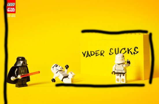


All of these things put together create harmony within the ad. It is obvious what the ad is suggesting to anyone with some knowledge of Star Wars and is funny and inviting. I think this ad did a great job in applying these principles.
The Journey Begins
Thanks for joining me!
Good company in a journey makes the way seem shorter. — Izaak Walton

